5 Ways to Improve Your Amazon Listings Today

In this Amazon focused post, Daniela Bolzmann of Mindful Goods, reviews some of our Parsnip community members Amazon listings for her Parsnip Amazon Awards. Daniela created the BUY NOW method for optimizing Amazon listings, so who better to highlight some exceptional use cases for the Parsnip community to learn from each other.
In this time of uncertainty, many brands are having to change their go-to-market strategies. Budgets are shifting to eCommerce and many brands are investing more time and dollars into their Amazon listings.
These are the 5 main areas you’ll want to focus on in addition to some best practices to get you started. Tackling these areas before running advertising will reduce wasted ad spend and organically increase traffic to your listings. Amazon reports that A+ content increases sales by an average of 5.6% and brands have reported conversion rate increases of 40%+. Read on for 5 ways to improve your Amazon listings today and the Parsnip Amazon Awards!

Main Image Award
Best Main Image Award goes to: Rise Brewing Co
What they did well: The goal for the main image is draw attention in search results to improve clickthrough rate. Rise was able to do just that.
Ensure your main image pops with these best practices:
- DO upgrade to 3D renderings for more vibrancy and crisp definition.
- DO add ingredient elements or closeups of your product for interest.
- DO reduce white spacing to make your image appear as big as possible.
- DO check your main image in search results and see if it draws attention in some way.
- DO check it on mobile to see if your product appears to be the max size possible.
- DON’T add too many text icons to your main image. This is against terms of service and can get your listing suppressed, which results in lost sales until you notice and fix.
- DON’T take photos with your iPhone or at home in a light box, get professional work done here. It will pay off in the long run.
BONUS PRO TIP: Use our favorite tool, PickFu, to split test main images to make sure you have a winner. Here’s a link to get 50% off your first test.
In the image on the left below you see can a photo that has too much white space around the edges with nothing interesting to draw the shoppers eye.
By contrast, on the right, Rise appears bigger, brighter and also has the added interest of the glass to show size/volume comparison at a glance for shoppers.
Here is another example of 3D renderings we had done for a client. You can see how creative you can get when you spend some time looking at your competition in search results.

Product Images Award
Best Product Images Award goes to: Mike’s Hot Honey
What they did well: Mike’s Hot Honey uses a mix of lifestyle imagery and infographics to draw interest, educate and sell visually, while building trust.
Ensure your product images do the selling with these best practices:
- DO lead with nutritional facts when selling food.
- DO call out ingredients with text layovers to make it easy for shoppers to see.
- DO have a minimum of 6 product images that are different from your main image.
- DO make sure each image serves a purpose or sell another value to shoppers.
- DO use a good mix of image types (ie: back of label, lifestyle, recipe, product in use, text call-outs, close-ups).
- DO add certification/quality icons to build trust.
- DON’T add images just to fill the available slots, think through each image.
- DON’T use low quality images.
BONUS PRO TIP: To make product images even better, I would:
- Combine the nutritional facts with the back of bottle in a side/side format to maximize the usage of the image
- Use one of the image as a coupon image
- Add text layovers to each product image
- Improve the main image to improve clickthrough in search results
Below you can a bestselling hair brush. The brush in every image with a text call-out that highlights a unique feature/benefit and shows different angles from close-ups to showing the product in-use.
Whereas, Mike’s Hot Honey shows the product-in-use, being poured on pizza, which literally made me drool but also shows the nutritional facts and a fun recipe to try at home.

SEO Award
Best SEO optimization goes to: ReGrained
What they did well: Amazon is a search engine first, Regrained has infused plenty of keywords into their listing copy and in just the right places to ensure they get found by shoppers.
Ensure your products get found with these best practices:
- DO invest in keyword research, it pays dividends of organic traffic to your listings.
- DO invest in professional copywriting to position and persuade shoppers.
- DO format bullets to start with ALL CAPS for easy skimming.
- DO think through the 5 bullets to share the most important selling points.
- DO put the main and most relevant keywords in the title towards the front.
- DO be sure to add keywords to the search terms and subject matter in the back end.
- DON’T keyword stuff. Start with great copy then infuse the main target keywords.
BONUS PRO TIP: In addition to these 5 ways to improve your Amazon listings today: avoid changing your listing copy all at once unless you have nothing to lose. Changing everything will de-index your keywords for a bit which may take a couple weeks to regain.


A+ Content Award
Best A+ Content & Best in Class goes to: JOI
What they did well: JOI used a combination of vibrant colors, saucy copy and scroll-stopping imagery to make sure their A+ content addresses customers’ top barriers in buying their new product.
Ensure your A+ content improves conversion rate with these best practices:
- DO decide the main objectives of your A+ content first.
- DO use modules that allow you to maximize space .
- DO research on what shoppers need to know before buying.
- DO avoid using big blocks of text, shoppers want to skim.
- DO use your USP (unique selling point) top and center.
- DO share your values, benefits, uses/how to use, and press mentions.
- DON’T just pick a template and start copy/pasting from your website and Dropbox.
BONUS PRO TIP: Learn from brands that stand out on Amazon. JOI’s A+ content was so similar to our approach that we recorded some bonus footage to walk you through our thoughts exactly.
Below, you can see a great starter version of A+ content by Fish People. It’s totally fine to start with what you have, like they did here!
If improving conversion is the goal, think through the barriers to buying to create custom content that grabs attention like JOI.

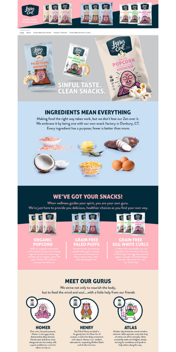
Best Storefront Award
Best Storefront goes to: Lesser Evil
What they did well: Your storefront is really the only place Amazon gives brands for storytelling without having your competitors ads all over the page. Lesser Evil took advantage of the storefront with eye catching creative and powerful copy that tells you exactly what they stand for and clearly demonstrates their 3 product offerings and better-for-you positioning.
Ensure your Storefront takers shoppers from browsing to buying with these best practices:
- DO lead with a bold USP or power statement.
- DO infuse color with bright crisp full scale headers.
- DO share your story and values on the home page.
- DO include bestsellers above the fold.
- DO sort products into categories when you have more than 10 product offerings.
- DO think of this as a tool for top of funnel education.
- DO make sure all your listings are properly linking to your storefront.
- DO test running ads to your storefront, often times we see these performing well.
- DON’T add too many pages. Less is more to avoid shoppers getting lost.
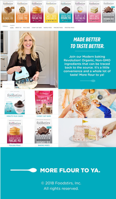
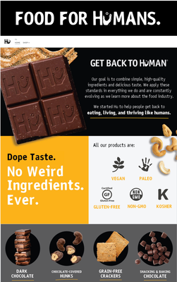
Runner Up Storefront Awards go to: Hu Kitchen & Food Stirs
What they did well: We chose 2 runner-up brands for best Storefront to demonstrate how brands can implement simple storefronts with both fewer SKUs like Hu Kitchen and with dozens of SKUs like Food Stirs.
For The Win
To step up your Amazon game, we always recommend starting with these 5 ways to improve your Amazon listings today. We also have a 25-point checklist to help you think through the process of our BUY NOW method here.
We’ll leave you with some final thoughts to chew on….
Amazon is an online marketplace with endless shelf space. Your products can be displayed right next to the largest CPG brands in the world, immediately. It’s also the #1 place shoppers search for products online. What we see, is that many of the incumbent players still don’t invest in their Amazon optimization. This is because they have large catalogs, enough legacy brand recognition, and deep advertising budgets to get sales with minimal effort.
Shoppers habits and lifestyles are changing, so therein lies an opportunity. People want fresh, new, and better-for-you products that meet these shifting needs. Because of these combination of factors emerging brands have the leg up in the speed of which they can improve their listings to grab attention and market share while the larger brands are slow to adapt to online selling.
About Daniela

Daniela Bolzmann is the Founder of Mindful Goods, an Amazon agency for brands that impact. She created the BUY NOW method, a simplified the process to get high-quality Amazon listings done better by creative marketers who can make your products stand out & sell. Find their full list of done-for-you Amazon services at mindfulgoods.co.
Special Parsnip Offer
For a limited time, get $100 off a mini audit of your Amazon page with Daniela using code PARSNIP100. Head to her site to learn more!


