Bright, Bold, or Dark - What Different Styles of Photography Can Say About Your Product
This week's blog post comes to us from Gwendolen Squires, a freelance food and product photographer located in Los Angeles, CA.
Can you think of a few places you’d like to include images so you can better reach your target audience? Maybe you’re dreaming of an eye-catching newsletter banner image, a scroll-stopping recipe photo for your blog and social media, or updating your sell sheet image so you can go after that new account.
Whatever the reason, photography can be an investment, so clearly articulating your vision for your brand's images, or understanding a concept that is being pitched to you by a photographer or art director, will help you to get as much value out of each shoot as possible.
As a full-time food photographer and Art History major, I’ve identified the 3 main styles of current product photography and want to take you through their elements so you can understand what each style says about your product.
The reason you’re investing is probably that you want to connect more with your target audience and increase sales. So, it’s a logical first step to be sure you have a fairly clear idea of who your target audience is. Even if it’s a loose definition, it helps if you can identify this before you start as it will impact every decision you make when it comes to the aesthetics of your custom image package.
Let’s imagine for a moment that your target audience is busy (working), suburban moms, who love to share experiences with their families, value healthy and organic habits (and products that support them) and do the majority of meal prep while still making time for their own general wellness.
For this target audience, you need to imagine what this mom - let’s call her Laura - is thinking and what feels familiar to her. I’m guessing her kitchen has a lot of white, maybe some handmade ceramics, but probably also some Ikea or World Market dishes (kids break things after all). Laura may also have some plants in that kitchen, but overall it’s functional, clean, and well-loved.
Whether you realized it or not you probably have been able to picture what Laura’s kitchen looks like in your mind. Maybe you were even able to see your product on Laura’s kitchen counter. This is why having a target audience clearly defined is so essential - it helps you visualize what your ideal client is looking for and what will appeal to them before you start and you can then incorporate those elements into your brand imagery.
Let’s discuss 3 main styles of photography so you can see the impact this has on your custom images.

Photos by Gwendolen Squires
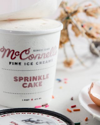
Light & Airy
In the case of Laura, I would guess that she would feel very comfortable with the Light & Airy style of photography. These names vary from photographer to photographer, so you may have heard it called something else, but the general qualities are the same. This style tends to be characterized by light background, surfaces, props, clearly lit labels/scenes, and generally lots of white negative space, especially in the corners.
This style has many advantages. It is great for specialty food products because it is clean, not distracting, and aspirational (who doesn’t want a bright, sparkling kitchen?!). Clean eating, wellness, organic, or spa-like brands all tend to do well with this style because it is recognizable and attractive to their target audiences. Because it is not distracting, it is excellent at highlighting ingredients, specific uses, or specific qualities of your brand. Colors are generally consistent and recognizable, and due to the white negative space it can be convenient for overlaying text or extending images* (let’s say you commissioned only 1:1 posts, but you realize you also need a website header. If you relicense the image and have the sides extended, you could re-crop the image to fit another ratio without interfering with the carefully arranged composition).
Although this style has many advantages, it’s important to remember that it’s extremely common and can be boring to consumers whose feeds and media are full of light and airy images of food. Of course, not everyone will find it boring, but conjure up in your mind a picture of a Pepperidge Farm box of cookies and the image on the front. That’s about as bright and airy as it gets, and now consider that compared to the next image.
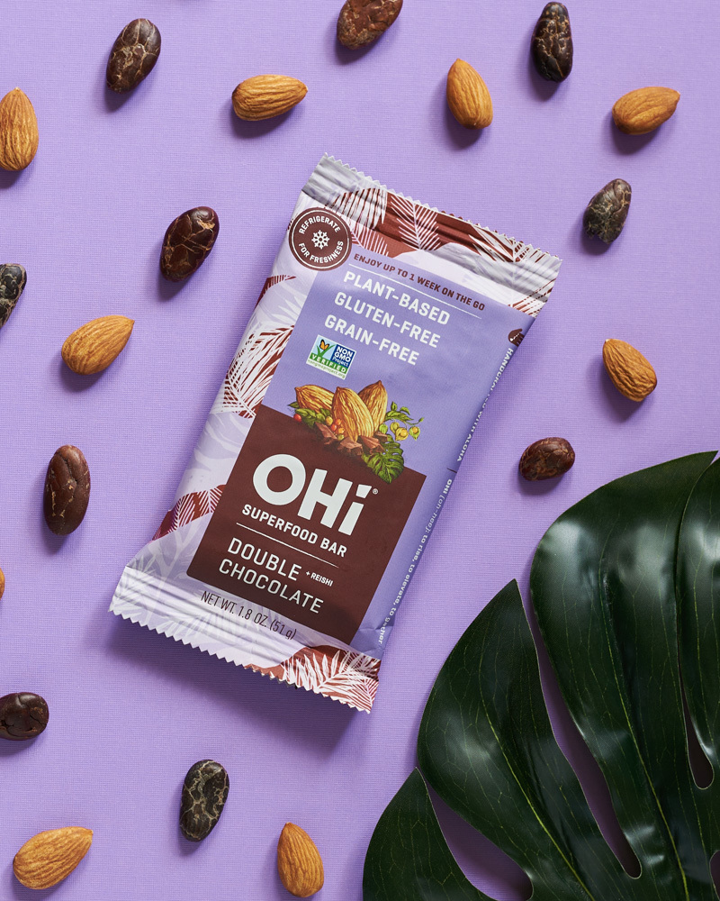
Photo by Emma Zilber
Modern
This image is entirely different and I can imagine this style being very familiar and appealing to a certain group of pink-haired, rollerskating, social media savvy recent college graduates who are just starting to enter the workforce for the first time.
This modern style of product photography is all about contrast. Just like the Bright & Airy style, it is great for specialty food products like snack foods, food innovators, and trendy foods that are appealing to young, hip, and trendy audiences. It typically features hard shadows, solid and brightly colored backgrounds and props, and occasionally geometric patterns. It is great because it is very trendy, clean, fun, and bright. It’s also eye-catching - and who doesn’t want to catch their target audience’s eye and stand out from the crowd?
Brands that are trying to capture millennials' or Gen-Zers' hearts tend to do well with this style because it is recognizable and attractive to their target audiences and their off-beat, positive vibes. It is excellent at directing attention to specific ingredients, product uses, or qualities of your brand.
Although there’s a lot to love about this style, it’s important to remember that it can be intense and if not done intentionally it can make no sense and show every bit of dust and scratch. Editing typically is more labor-intensive, and colors may cast strange hues onto products and labels. It’s also less familiar to potential customers although it’s becoming more common.
Photos by Gwendolen Squires
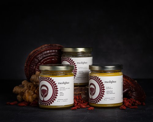
Dark & Moody
The last style I’ll describe is the beloved and controversial Dark & Moody style. It is recognizable by dark backgrounds, deep shadows, rustic surfaces, and sometimes older props with lots of character. Typically these photos have rich, deep, and dark colors. Sometimes these images have corners that fade to black, or they may lighten slightly at the corners. Regardless, there is typically a lot of texture and the overall look is full of shadows. As you can imagine products with rustic, or ancient selling points, or with a moody quality can really shine when using this style. Due to the play of light and shadow products (especially light ones) can really pop when lit correctly. It can be very dramatic, and excellent at directing attention. It can clearly separate your product from others - especially if your competitors are mostly using a different style.
Despite its ability to tell a compelling story, it can be difficult to make it look ‘natural’ and can be hard to execute. It can also overpower your product or appear dull and dingy if not lit and edited well. Typically this style also requires more experienced editing for images to really pop.
Is there one style of image that immediately jumps out to you as being perfect for your product? I find that most brands tend to use the Light & Airy style and it’s a great starting point if you aren't sure where to start. Remember that whatever style you choose, try and identify the visual elements of it that relate to your brand, and make sure that whoever is styling the images is selecting props, backgrounds, and surfaces that relate.
I’d love to hear your thoughts on these styles! Just like art, styles and elements can be endlessly combined to create different looks and moods and tell different stories. There are endless choices to be made, but hopefully, this article will help you think about visual elements and styles and the impact they have on your brand. Is there a style I missed that you think should be included? Which elements resonate with your brand?
-
Gwendolen Squires is a freelance food and product photographer located in Los Angeles, CA. She specializes in bringing the creations of CPG and food producers to life through custom visual content for brands big and small. She also runs The Food Photography Roundtable where her peers in the industry gather monthly to discuss the business and creative side of food photography to better serve our clients just like you!
Website: www.gwendolensquires.com
Instagram: @gwendolen_squires


