How To Create A Welcome Series That Converts Part 1

Window shopping pretty much ends at the window. Once you walk away, the store associates have no way of reminding you about that shirt you saw and loved. And, it would be a little weird if you were sitting in the coffee shop a few hours later and one of them walked in to tell you all about the brand!
E-commerce marketing allows you the unique ability to stay top of mind for a customer a lot easier than brick and mortar. An automated welcome series as a part of your email marketing strategy is some serious low-hanging fruit when it comes to taking advantage of that ability. So, here are my steps on how to create a welcome series that converts!
Hey, look here at me!
Grab your customer’s attention right away. If it aligns with your brand's discount and perception strategy, offering a discount or purchasing incentive in your pop-up will give them the impulse to give you their email - and from there you have a lot of control over how often they hear from you, and what they hear.
Some examples of incentives that range from discounts, to freebies, to general offers:
- 20% Off Your First Purchase
- A Free Sample Size With Your First Purchase
- Free Shipping On Your First Purchase
- 20 Recipe E-Book When You Order
Measuring Success: The metrics of success of your pop-up is the sign up rate. 2% is a great place to be, 4% and up is fantastic!
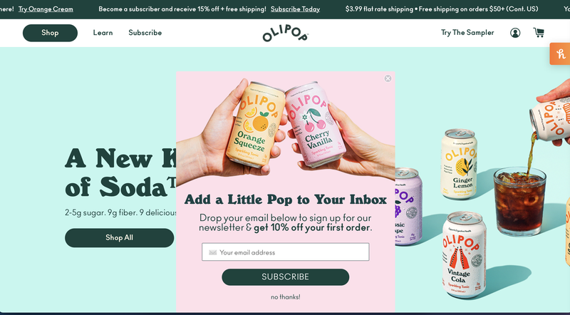
In the Olipop example above they do a great job of having a catchy headline, vibrant color, and enticing offer to get folks to sign up! I also like that they are promoting their subscription service and shipping policy in the top banner. They even give you instant gratification of having the coupon code immediately after pressing submit. If you do this you still want to make sure to deliver an email with the code because they will have to close out the pop up to shop!
Start With Giving Them What They Want
You offered them an incentive, now deliver on it! This is key in creating a welcome series that converts. I don’t shy away from hiding the offer redemption code in this first email. The customer is likely sitting in front of their email inbox, refreshing and waiting for the promised discount code. Make sure this first email triggers immediately after they sign up.
In the first email I will typically design a catchy header that places the product in a setting or recipe that is so enticing it cannot be ignored. Conversion is your goal here - pull out your best photo assets!
I will then give them the information they need to redeem the offer I advertised in the pop up.
I then give the highest level differentiators, values, etc. The chances they read this section are slim since they just want the code, but you want to provide this info in case they are reading or skimming! Buzzwords to catch the eye are great here.
At the end, I will show top selling products, seasonal products, etc to put the brand’s best face forward to help conversion rates further.
Measuring Success: For this first email the measurements of success are as follows:
- Open Rate: With the new security measures, take your open rates with a grain of salt but you should still be seeing rates above 20% for a welcome series. If you aren’t, you are either ending up in SPAM or you need to test some new subject lines. My clients have been seeing an increase to ~60% with the new IOS security, which is skewing open rates higher.
- Click Rate: How many folks are heading to your website after receiving this email? This number should be fairly high for the first email of a welcome series since they JUST signed up, 15%+ would be a good benchmark here.
- Conversion Rate: Again, conversion rates here are typically higher than the average email or ad because the customer has already expressed interest. Over 10% here would be great with most of my F&B clients falling around 16% right now.
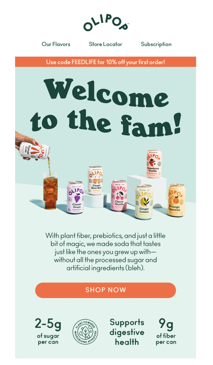
In the Olipop example above I like that they immediately deliver the code in the top bar, but the photo takes the attention of my eye first. All the flavors are represented, the pouring of one allows me to see the product in action, and the colors are bright and refreshing. They go over their value proposition quickly and effectively, and the icons allow further skimmability. There’s a clear shop now button which helps drive the conversion.
If you found this helpful, stay tuned in two weeks for How To Create A Welcome Series That Converts Part 2 where I will go over what I include in the next three emails in the series to boost sales and leave customers feeling attached to the brand.
---
Want more from Parsnip? Follow us!
This round up was written by Emily Hines, a freelance brand manager for CPG brands. Her specialty is email marketing and email automation!


