7 Ways to Make Your Homepage Irresistible to Customers

Our guest blog this week comes from Celsea Jenkins at GrassFed Copy. Celsea helps leaders and growing brands in the health + wellness space clarify their message to sell more without feeling like icky salesmen, or losing sight of their vision.
Remember back in the good old days when window shopping was a thing? That perfect dress or pair of shoes would catch your eye and just like that, seduce you into the store to try them on.
Enter the internet age. Your homepage has become that department store window. In fact, it’s even more important than that because attention spans are getting shorter — think 3-5 seconds — to communicate to your potential customer exactly what your product does, and how it can help your customer, before they lose interest and go back to the Google drawing board.
To ensure you get the most important information to your audience, and convince them to go deeper in to your site, there are several must-haves for your home page.
The good news? They’re all simple to implement and once you get the foundations down you can sprinkle in extra personality with ease! So, here are seven ways to make your homepage irresistible to customers.
1. Do you know who you’re talking to?
The first step to creating your homepage copy is clarifying your ideal client and speaking straight to them. Just like Amber mentioned in her recent guest post, you’ve got to take the time to talk to your audience, regardless of how big or small your brand is. Even if you only have a few customers, talking to them and reading their reviews/thoughts will give you pure gold information, what we copywriters call “voice of customer,” and make writing your homepage a breeze. If you don’t yet have customers that’s ok. You can still read competitor reviews, talk to your ideal clients about their experiences with similar products, and gain insights in other creative ways.
That’s it. does a great job making their CTA front and center and providing a headline and sub ext to get people to click the button quickly! They know their audiences top concerns, probably from gathering voice of customer data.
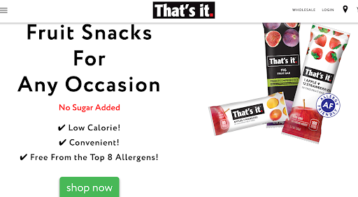
That’s it. does a great job making their CTA front and center and providing a headline and sub ext to get people to click the button quickly! They know their audiences top concerns, probably from gathering voice of customer data.
2. Start with the end in mind
A great way to write your homepage copy is to start with what you want a potential customer to do once they’ve read your brilliant words and are ready to take action. Therefore, decide what your call-to-action is and then write backwards from there. What do you need to say or prove before customers are ready to hit the ‘shop now’ or ‘learn more’ button?
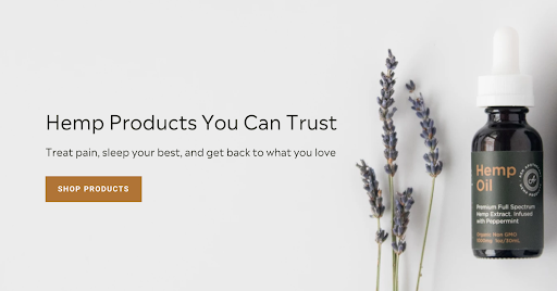
Ash Apothecary does a nice job quickly summing up what the product is, who it’s for/why it’s desirable, and specifically what it can help with. They could amp up the memorable factor, and make it a bit more specific how they are different than other hemp products, but all- in-all clear wins over clever every time!
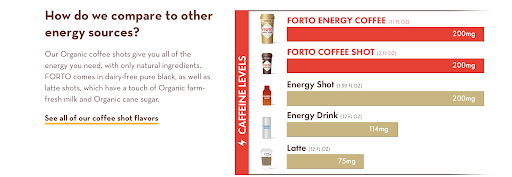
Forto coffee quickly tells shoppers what they want to know...how their product is better than the others. It’s unique (although that first sentence could be jazzed up), they quickly show customers why their product is better (more caffeine, of course) they’re also very specific about what’s in it right away, well played Forto!
3. Identify your X Factor aka Unique Value Proposition?
This should be front and center on your home page to make it irresistible to your customers! What does your product or service do better than any other? What is the main problem that it solves for your ideal customer? After you write your value prop, make sure it’s: unique, desirable, simple, memorable, and specific!
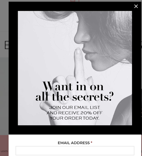
Hush & Hush is nailing the email opt-in pop-up with a very on-brand headline and tempting discount code to boot!
4. Create an enticing email opt-in
Building an email list to nurture your raving fans starts on your homepage. Asking someone to get on your list for ‘email updates’ is boring and doesn’t create urgency for them to join. Adding an offer or a valuable lead magnet that gives a piece of coveted information to your audience is important for every brand.
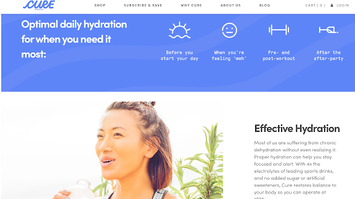
Cure Hydration does a great job of breaking up their site into important pieces, guiding the reader down the page and capturing their attention with different elements.
5. Break it up into bite-size chunks
It’s hard to read giant chunks of text on any webpage, but the homepage especially. Break up your copy with headlines, sub-headlines, images, and icons. Allow your text to have some space around it to breathe!
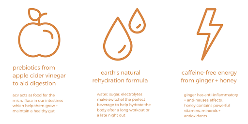
Drink Sunomi does a great job of highlighting both features and benefits on their homepage. They give the feature and then below that, tell the reader how it’ll help them.
6. What’s in it for me?
It’s very natural for brands to create a huge list of the many features of their products, but not always the benefits of those features. Your features—just like features on your face—are the physical attributes or details. The benefits, on the other hand, are what you get from those features. As an example, we all have eyes (feature), but the benefit of our eyes is that we can see and therefore our life experience is enhanced. This point is really important for health and wellness brands because people buy based on emotion and the pain that they are currently experiencing, so showing them how you solve that pain clearly is very important.

Hey Frida has some high-powered social proof. We can tell who their audience is just by these testimonials, Millennials who are avid Instagram users and interested in celebs. Pro-tip, add personality by calling your testimonials something other than ‘testimonials,’ like, ‘what our fans are saying (see below).’

Hush & Hush has used their testimonials to answer pain points that other buyers may have, ie. “doesn’t taste like grass.” and, “already noticed a difference in the amount of energy I have.”
7. Bring on the social proof!
You can have an incredible product, beautiful website, and thoughtful content on social media, but without social proof you probably won’t make the sale. Why? Because social proof gives your brand credibility, answers objections and helps customers trust you. It also improves your SEO via more favorable language of your brand online. There are several types of social proof, testimonials, ‘featured in’ section with all of the praise you’ve received from press, case studies, and more. Focus on gathering these and you’ll see huge returns!
So, if you are ready to step up your game, give these seven ways to make your homepage irresistible to customers a try.
GrassFed Copy is your one-stop shop for web and email copy that speaks the language of your ideal client, sounds true to you, and helps you build a community of raving fans. Whether you need a full copy overhaul on your website, or some suggestions to make it shine and sell, I can help! Connect with me at Grassfedcopy.com or @celseajenkins on Instagram.


